Team Sternfit
A recruiting site for Team Sternfit, the team behind three fitness projects: Motiny, Trainy and Sternfit. Sternfit is a platform where athletes view and share each other’s workout programs.
My role
Designer
- User flow and wireframes
- Loader animation and first screen
- Main page and brand pages
- Photo selection and treatment
- Phone layout
Team
I worked with Roy Huang, Co-Founder of Team Sternfit.
First screen
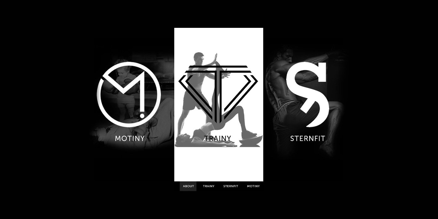
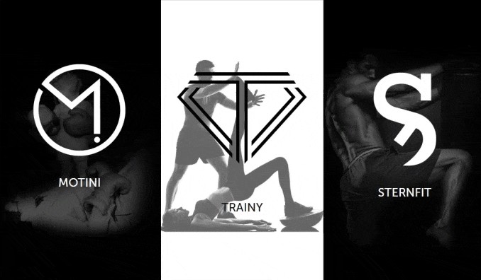
Three brands on one screen
The site opens with a short loader: the line “Team up, we train.” between two thin rules on black. Then the three brands appear as tall panels side by side. Pointing at a panel makes it wider, and the menu under the panels leads to each brand’s page.
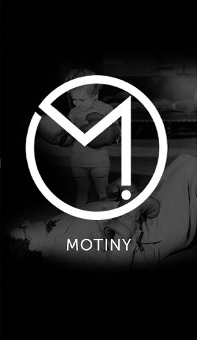
Motiny
What motivates you
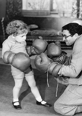
An old black and white photo of a small child in boxing gloves sparring with a man. The mark is an M inside a circle, ending in an exclamation mark.
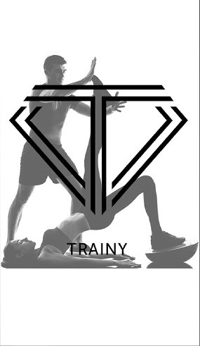
Trainy
Team up, we train
A trainer stretching a woman’s leg, as a silhouette on white. Trainy is the only white panel of the three. The mark is a T inside a diamond, drawn with double lines.

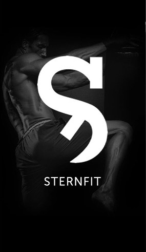
Sternfit
Be stern, be fit
A fighter kneeing a heavy bag, the same photo as on the site’s cover. The S mark is cut through by a diagonal line and also signs the cover and the footer.

Other photos
Two more photos were picked for the content pages: a boxer at a bag with red hand wraps and an athlete resting on a bench in the gym.


Main page
The story under the first screen
Below the panels, the main page tells how the team started, in five blocks. Each block is a dark photo with a few lines of text in capitals. Two Get in touch buttons lead to the join form.
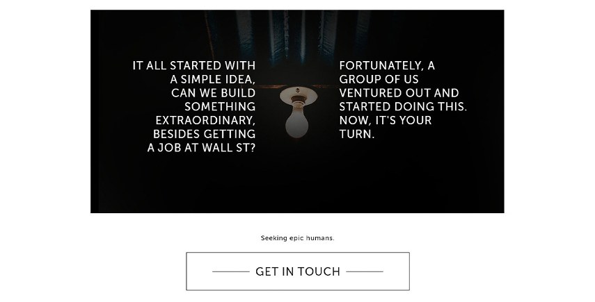
“It all started with a simple idea, can we build something extraordinary, besides getting a job at Wall St?”
Two columns of text on either side of a hanging light bulb, then “Seeking epic humans” and the first Get in touch button.
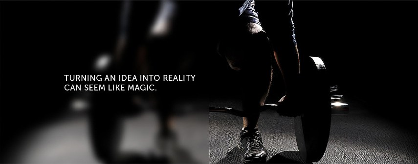
“Turning an idea into reality can seem like magic.”
The same line as on the cover, over an athlete gripping a barbell plate. The left half of the photo is blurred to keep the text readable.
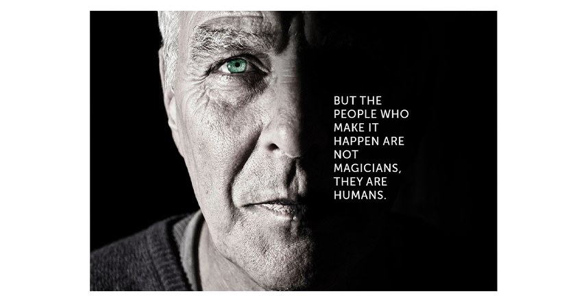
“But the people who make it happen are not magicians, they are humans.”
Half of an older man’s face in hard light, with the text in the dark half.
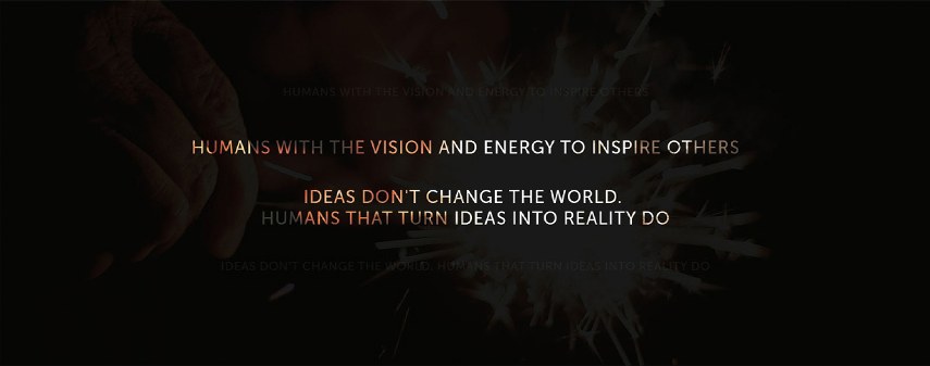
“Ideas don’t change the world. Humans that turn ideas into reality do.”
Centred lines over sparks, with some of the words in copper. Fainter copies of the lines sit above and below.
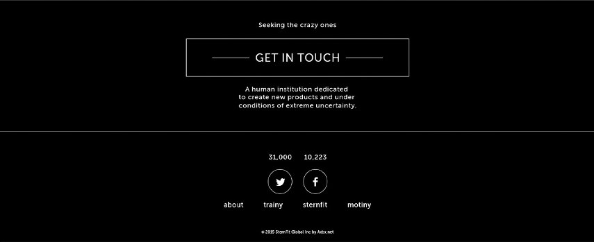
“Seeking the crazy ones.”
The footer has the second Get in touch button, a line about the team, follower counts for Twitter and Facebook, and links to About and the three brand pages.
User flow
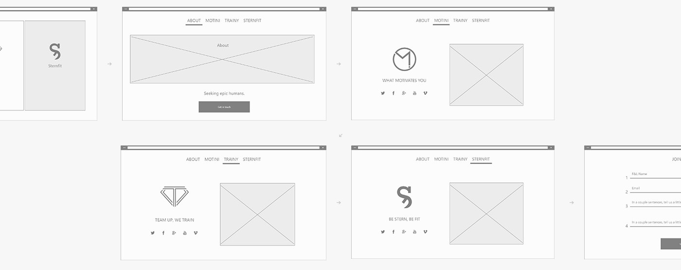
From the first screen to the join form
The wireframes follow one visit: the first screen, About, the Motiny, Trainy and Sternfit pages, then the join form. Each brand page has its mark, its line and social links next to a photo. The form asks for a name, an email and two short answers.
Responsive
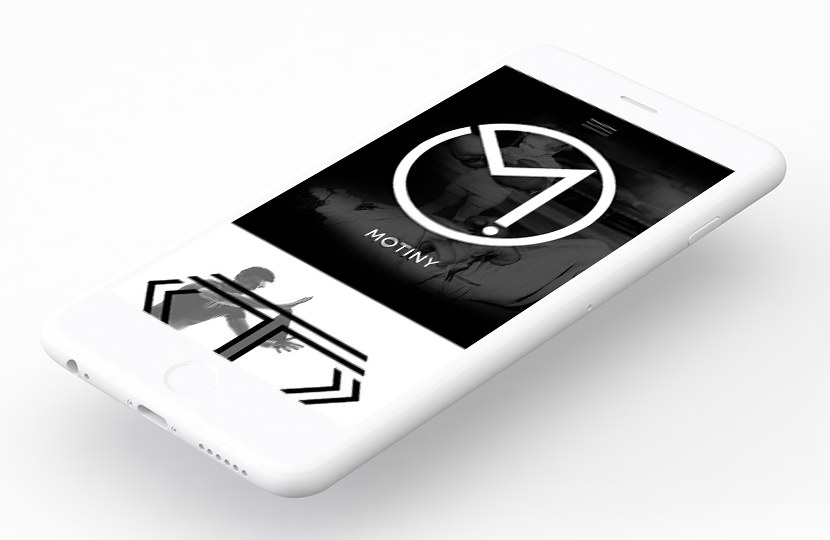
Phone layout
The layout works from 320px wide. On a phone the three panels stack, each as wide as the screen, and the menu moves behind a button at the top right.
Style guide
Type and colours
The site uses two typefaces and three colours. Everything else comes from the black and white photos.
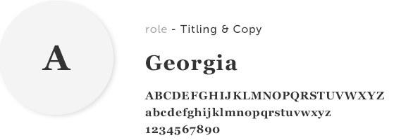
Georgia
Titles and copy, including the TEAMSTERNFIT wordmark on the cover.
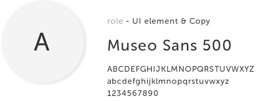
Museo Sans 500
Interface elements and copy: the brand names on the panels, the menu, the buttons and the lines in the blocks.
Colours
Text
#333333Text on white
Hover
#888888Links and buttons on hover
Background
#FFFFFFPage background