Design system
The foundations and components behind this portfolio, taken from the live code.
Foundations



Components

What is not included
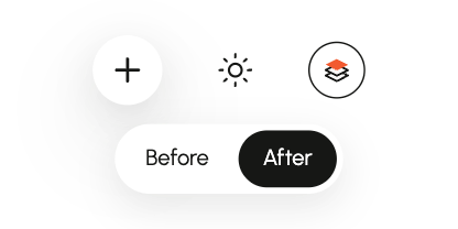
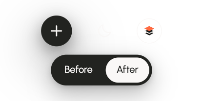
- Before and afterLets a reader switch between before and after images.
- MediaAn image or video in a case study, with its frame and play controls.
- StepsShows a sequence as numbered steps.
- WalkthroughThe guided video on a case study, built from Button, Icon button, the Media icons and the floating-control surface.
- Project colors, fonts and artworkEach case study keeps its own brand.
- Page sectionsHero, About, Contact and footer, built from the parts above.
- Case-study layoutsEach case study has its own structure.
Dividers, card outlines, tags, dot grid
Outlined buttons and icon buttons
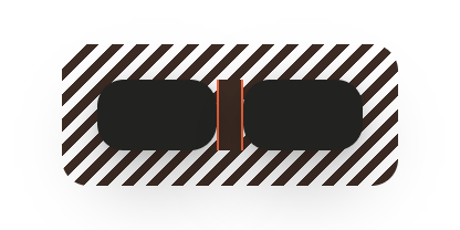
Keyboard focus on every control
Video progress track
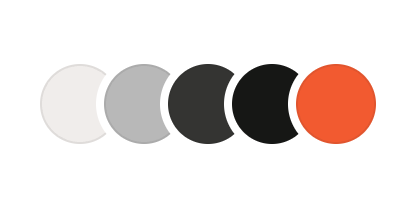
/* Palette · src/styles/tokens.css */
:root {
  --color-white: #FFFFFF;
  --color-paper: #FAF8F7;
  --color-mist: #F0EDEB;
  --color-stone: #DEDAD7;
  --color-silver: #B8B8B8;
  --color-pewter: #747474;
  --color-graphite: #343432;
  --color-charcoal: #222320;
  --color-ink: #161715;
  --color-night: #0F100E;
  --color-orange: #F25A30;
  --color-orange-light: #FF6B42;

  /* Transparent shades */
  --color-ink-64: rgb(22 23 21 / 0.64);
  --color-ink-16: rgb(22 23 21 / 0.16);
  --color-ink-8: rgb(22 23 21 / 0.08);
  --color-paper-64: rgb(250 248 247 / 0.64);
  --color-paper-10: rgb(250 248 247 / 0.1);
  --color-paper-8: rgb(250 248 247 / 0.08);
}
/* Roles · light (default) */
:root,
[data-theme='light'],
[data-color-zone='light'] {
--color-bg-section: var(--color-ink);
--color-text-primary: var(--color-ink);
--color-text-primary-hover: var(--color-graphite);
--color-text-secondary: var(--color-ink-64);
--color-text-on-primary: var(--color-white);
--color-bg-canvas: var(--color-paper);
--color-bg-surface: var(--color-white);
--color-bg-surface-subtle: var(--color-mist);
--color-border-default: var(--color-ink-8);
--color-interactive-accent: var(--color-orange);
--color-video-track: var(--color-ink-16);
--color-rain-icon: var(--color-ink);
--color-footer-icon: var(--color-silver);
color-scheme: light;
}
/* Shared roles · local text and
backdrop in both modes */
/* Resolve tint locally · keep project accent overrides. */
:root,
[data-theme],
[data-color-zone],
:where(.skill-tag--accent),
:where(.case-study-decision-card__icon) {
--color-bg-accent-subtle:
color-mix(in srgb, var(--color-interactive-accent) 12%,
var(--color-bg-surface));
}
:root,
[data-theme],
[data-color-zone] {
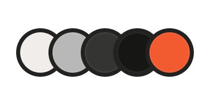
--color-border-control: var(--color-text-primary);
/* Hero frames · follow the local page or card surface */
--color-media-frame: var(--color-bg-canvas);
--color-focus-ring: var(--color-text-primary);
--color-backdrop: rgb(0 0 0 / .18);
}/* Roles · dark */
[data-theme='dark'],
[data-color-zone='dark'] {
--color-bg-section: var(--color-night);
--color-text-primary: var(--color-paper);
--color-text-primary-hover: var(--color-stone);
--color-text-secondary: var(--color-paper-64);
--color-text-on-primary: var(--color-ink);
--color-bg-canvas: var(--color-ink);
--color-bg-surface: var(--color-charcoal);
--color-bg-surface-subtle: var(--color-graphite);
--color-border-default: var(--color-paper-8);
--color-interactive-accent: var(--color-orange-light);
--color-video-track: var(--color-paper-10);
--color-rain-icon: var(--color-stone);
--color-footer-icon: var(--color-pewter);
color-scheme: dark;
}
/* Scoped surfaces · retain
inherited page artwork and
section bands */
/* Surface · keep page artwork */
[data-zone-keep~='surface'] {
--color-bg-surface: inherit;
}
/* Focus · keep page ring on fixed-Light controls */
[data-zone-keep~='focus-ring'] {
--color-focus-ring: inherit;
}
/* Section · keep page band */
[data-zone-keep~='section'] {
--color-bg-section: inherit;
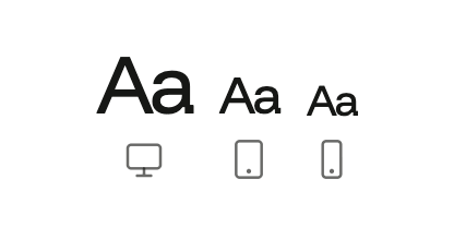
}Desktop
1024px and wider
Tablet
768–1023px
Phone
Under 768px
Funnel Display
Weight 400 · Regular
Line height 0.91
Hero and contact titles
Desktop
1024px and wider
Hello
76px · 4.75rem
Letter spacing -4.8%
Tablet
768–1023px
Hello
48px · 3rem
Letter spacing -4.6%
Phone
Under 768px
Hello
40px · 2.5rem
Letter spacing -4.5%
Funnel Display
Weight 400 · Regular
Line height 1.14
Section titles, numbers
Desktop
1024px and wider
Projects
56px · 3.5rem
Letter spacing -4.7%
Tablet
768–1023px
Projects
36px · 2.25rem
Letter spacing -4.4%
Phone
Under 768px
Projects
26px · 1.625rem
Letter spacing -4.2%
Funnel Display
Weight 500 · Medium
Line height 1.33
Project names
Desktop
1024px and wider
Voximplant Kit
24px · 1.5rem
Letter spacing -3.4%
Tablet
768–1023px
Voximplant Kit
22px · 1.375rem
Letter spacing -3.2%
Phone
Under 768px
Voximplant Kit
22px · 1.375rem
Letter spacing -3.2%
Urbanist
Weight 400 · Regular
Line height 1.50
Intros and descriptions
Desktop
1024px and wider
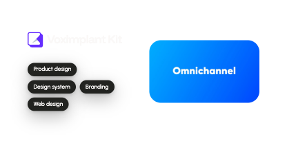
Launched from 0 → 1
20px · 1.25rem
Letter spacing 0%
Tablet
768–1023px
Launched from 0 → 1
18px · 1.125rem
Letter spacing 0%
Phone
Under 768px
Launched from 0 → 1
18px · 1.125rem
Letter spacing 0%
Urbanist
Weight 400 · Regular
Line height 1.50
Body text
Desktop
1024px and wider
Cloud contact center.
16px · 1rem
Letter spacing 0%
Tablet
768–1023px
Cloud contact center.
16px · 1rem
Letter spacing 0%
Phone
Under 768px
Cloud contact center.
16px · 1rem
Letter spacing 0%
Urbanist
Weight 500 · Medium
Line height 1.50
Buttons, navigation, subheadings
Desktop
1024px and wider
Get in touch
16px · 1rem
Letter spacing 0%
Tablet
768–1023px
Get in touch
16px · 1rem
Letter spacing 0%
Phone
Under 768px
Get in touch
16px · 1rem
Letter spacing 0%
Urbanist
Weight 400 · Regular
Line height 1.43
Supporting text, captions
Desktop
1024px and wider
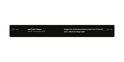
DataGPT · San Francisco, remote
14px · 0.875rem
Letter spacing 0%
Tablet
768–1023px
DataGPT · San Francisco, remote
14px · 0.875rem
Letter spacing 0%
Phone
Under 768px
DataGPT · San Francisco, remote
14px · 0.875rem
Letter spacing 0%
Funnel Display · Uppercase
Weight 500 · Medium
Line height 1.43
Section labels
Desktop
1024px and wider
01 / Selected work
14px · 0.875rem
Letter spacing -3.6%
Tablet
768–1023px
01 / Selected work
14px · 0.875rem
Letter spacing -3.6%
Phone
Under 768px
01 / Selected work
14px · 0.875rem
Letter spacing -3.6%
Urbanist
Weight 500 · Medium
Line height 1.33
Tags and chips
Desktop
1024px and wider
Product design
12px · 0.75rem
Letter spacing 0%
Tablet
768–1023px
Product design
12px · 0.75rem
Letter spacing 0%
Phone
Under 768px
Product design
12px · 0.75rem
Letter spacing 0%
Changes on this device
/* Font families · src/styles/tokens.css */
:root {
  --font-heading:
    'Funnel Display Variable', 'Funnel Display', Arial, sans-serif;
  --font-body: 'Urbanist Variable', Urbanist, Arial, sans-serif;
}
/* Styles · phone is the default */
:root {
/* Heading/XL */
--font-heading-xl: var(--font-heading);
--font-weight-heading-xl: 400;
--text-heading-xl: 2.5rem; /* 40px */
--line-height-heading-xl: .909091;
--letter-spacing-heading-xl: -.045em;
/* Heading/L */
--font-heading-l: var(--font-heading);
--font-weight-heading-l: 400;
--text-heading-l: 1.625rem; /* 26px */
--line-height-heading-l: 1.142857;
--letter-spacing-heading-l: -.042em;
/* Heading/M */
--font-heading-m: var(--font-heading);
--font-weight-heading-m: 500;
--text-heading-m: 1.375rem; /* 22px */
--line-height-heading-m: 1.333333;
--letter-spacing-heading-m: -.032em;
/* Body/L */
--font-body-l: var(--font-body);
--font-weight-body-l: 400;
--text-body-l: 1.125rem; /* 18px */
--line-height-body-l: 1.5;
--letter-spacing-body-l: 0em;
/* Body/M */
--font-body-m: var(--font-body);
--font-weight-body-m: 400;
--text-body-m: 1rem; /* 16px */
--line-height-body-m: 1.5;
--letter-spacing-body-m: 0em;
/* Body/M Strong */
--font-body-m-strong: var(--font-body);
--font-weight-body-m-strong: 500;
--text-body-m-strong: 1rem; /* 16px */
--line-height-body-m-strong: 1.5;
--letter-spacing-body-m-strong: 0em;
/* Body/S */
--font-body-s: var(--font-body);
--font-weight-body-s: 400;
--text-body-s: .875rem; /* 14px */
--line-height-body-s: 1.428571;
--letter-spacing-body-s: 0em;
/* Label/M */
--font-label-m: var(--font-heading);
--font-weight-label-m: 500;
--text-label-m: .875rem; /* 14px */
--line-height-label-m: 1.428571;
--letter-spacing-label-m: -.036em;
/* Label/S */
--font-label-s: var(--font-body);
--font-weight-label-s: 500;
--text-label-s: .75rem; /* 12px */
--line-height-label-s: 1.333333;
--letter-spacing-label-s: 0em;
}/* Tablet · 768px and wider: only what changes */ @media (min-width: 768px) { :root { --text-heading-xl: 3rem; /* 48px */ --letter-spacing-heading-xl: -.046em; --text-heading-l: 2.25rem; /* 36px */ --letter-spacing-heading-l: -.044em; } }/* Desktop · 1024px and wider: only what changes */ @media (min-width: 1024px) { :root { --text-heading-xl: 4.75rem; /* 76px */ --letter-spacing-heading-xl: -.048em; --text-heading-l: 3.5rem; /* 56px */ --letter-spacing-heading-l: -.047em; --text-heading-m: 1.5rem; /* 24px */ --letter-spacing-heading-m: -.034em; --text-body-l: 1.25rem; /* 20px */ } }/* Use a style · src/styles/typography.css */ .text-heading-xl { font-family: var(--font-heading-xl); font-size: var(--text-heading-xl); font-weight: var(--font-weight-heading-xl); line-height: var(--line-height-heading-xl); letter-spacing: var(--letter-spacing-heading-xl); } /* Same for .text-heading-l … .text-label-s. .text-label-m also sets text-transform: uppercase. */ <h2 class="text-heading-l"> Projects </h2>
Spacing scale
4px · 0.25rem
48 uses
8px · 0.5rem
77 uses
12px · 0.75rem
74 uses
16px · 1rem
114 uses
24px · 1.5rem
156 uses
32px · 2rem
50 uses
48px · 3rem
20 uses
64px · 4rem
46 uses
96px · 6rem
18 uses
Layout
1024px and wider
Edge 64px+ · gap 24 · 2 project columns
768–1023px
Edge 64px · gap 24 · 2 project columns
Under 768px
Edge 24px · gap 16 · 1 column
Radius
8px
Project logo tiles
12px
Tabs, inner elements
24px
Cards and panels
40px · 24px on phones
Project cards, big boxes
Scales with the window · 59 → 100px
Work and About panels, desktop only
Fully round
Buttons, chips, tags
Elevation
Cards resting on the page
0 8px 24px rgb(22 23 21 / .10)
0 2px 8px rgb(0 0 0 / .16), 0 12px 32px rgb(0 0 0 / .28)
Menus, popups, tooltips and close buttons floating above content
0 8px 24px rgb(22 23 21 / .10), 0 24px 56px rgb(22 23 21 / .12)
0 8px 24px rgb(0 0 0 / .38), 0 24px 64px rgb(0 0 0 / .52)
/* Spacing ·
   src/styles/tokens.css */
:root {
  --space-1: 4px;
  --space-2: 8px;
  --space-3: 12px;
  --space-4: 16px;
  --space-6: 24px;
  --space-8: 32px;
  --space-12: 48px;
  --space-16: 64px;
  --space-24: 96px;
}
/* Radius · phone is the default */
:root {
--radius-xs: 8px;
--radius-small: 12px;
--radius-medium: 24px;
--radius-large: 24px;
--radius-xlarge: 40px;
--radius-full: 999px;
}
/* Radius changes · 768px and
wider */
@media (min-width: 768px) {
:root {
--radius-large: 40px;
--radius-xlarge: clamp(40px, 5.8vw, 100px);
}
}/* Layout · phone is the default */
:root {
--gutter: var(--space-6);
--header-inset: var(--space-6);
--grid-gap: var(--space-4);
--section-space: var(--space-16);
--safe-left: env(safe-area-inset-left, 0px);
--safe-right: env(safe-area-inset-right, 0px);
--safe-top: env(safe-area-inset-top, 0px);
--safe-bottom: env(safe-area-inset-bottom, 0px);
--gutter-left: calc(var(--gutter) + var(--safe-left));
--gutter-right: calc(var(--gutter) + var(--safe-right));
}
/* Projects: 1 column · metrics: 1 column */
/* Tablet and desktop · 768px and wider */
@media (min-width: 768px) {
:root {
--gutter: max(var(--space-16), calc((100vw - 1200px) / 2));
--header-inset: var(--space-8);
--grid-gap: var(--space-6);
--section-space: var(--space-24);
}
}
/* Projects: 2 columns · metrics: 3 columns *//* Shadows · light (default) */
:root,
[data-theme='light'],
[data-color-zone='light'],
[data-fixed-shadow='light'] {
--shadow-small: 0 8px 24px rgb(22 23 21 / .10);
--shadow-large:
0 8px 24px rgb(22 23 21 / .10),
0 24px 56px rgb(22 23 21 / .12);
}/* Shadows · dark */
[data-theme='dark'],
[data-color-zone='dark'] {
--shadow-small:
0 2px 8px rgb(0 0 0 / .16),
0 12px 32px rgb(0 0 0 / .28);
--shadow-large:
0 8px 24px rgb(0 0 0 / .38),
0 24px 64px rgb(0 0 0 / .52);
}
/* Scoped shadows · retain page
elevation when only copy
changes */
/* Elevation · keep page mode */
[data-zone-keep~='shadows'] {
--shadow-small: inherit;
--shadow-large: inherit;
}
/* Large · page; Small is Dark */
[data-zone-keep~='large-shadow'] {
--shadow-large: inherit;
}What moves
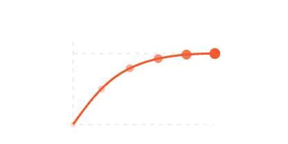
Logo wave
Letters lift one after another, then spring back.
- Settles
- 935ms
- Stagger
- 35ms
- Lift
- 3px
- Scale
- 1.05
- Curve
- Spring
Button fill
The fill grows out of the arrow circle and covers the button.
- Duration
- 450ms
- Curve
- Button fill
Arrow shift
Arrows and icon layers move 3px on hover.
- Duration
- 160ms
- Distance
- 3px
- Curve
- Ease out
Tooltip
Fades in while growing from 82% to full size.
- Fade
- 320ms
- Grow
- 440ms
- Starts at
- 82%
- Curve
- Entrance
Theme switch
The icon turns as the theme changes.
- Turn
- 600ms
- Press
- 100ms
- Curve
- Rotation
Card tilt
Project cards tilt toward the pointer.
- Angle
- Up to 6°
- Depth
- 1000px
- Timing
- Follows the pointer
Opening a project
The card travels into the page; the caption and copy follow.
Header pill
The floating menu grows when you scroll down.
- Grow
- 560ms
- Shrink
- 240ms
- Curve
- Header pill
Text reveal
Titles rise letter by letter and copy line by line as a section enters.
Hero role
The role under the main headline fades out and the next one rises in.
- Holds
- 1s
- Fades
- 450ms
- Curve
- Role swap
Filter
Cards shrink out, the grid moves and new cards rise in.
Skills ticker
Hero skills scroll up in a slow loop.
- Loop
- 13s
- Curve
- Linear
Other timings
Smaller moves that share the tokens above.
Easing curves
Entrance
Project travel
Filter
Button fill
Rotation
Header pill
Role swap
Scroll
Ease in
Ease out
Ease in-out
Linear
Spring
/* Motion · src/styles/tokens.css */
:root {
  /* Durations · feedback, entrances and travel */
  --duration-button-fill: 450ms;
  --duration-tooltip-opacity: 320ms;
  --duration-tooltip-scale: 440ms;
  --duration-case-open: 700ms;
  --duration-case-close: 400ms;
  --duration-case-caption-exit: 200ms;
  --duration-case-caption-enter: 600ms;
  --duration-case-body-enter: 350ms;
  --duration-case-radius: 260ms;
  --duration-entrance: 900ms;
  --duration-title-reveal: 900ms;
  --duration-copy-reveal: 900ms;
  --duration-role-hold: 1000ms;
  --duration-role-exit: 450ms;
  --duration-logo-wave: 935ms;
  --duration-skills-loop: 13.075s;
  --duration-toggle-enter: 600ms;
  --duration-header-enter: 560ms;
  --duration-header-exit: 240ms;
  --duration-toggle-return: 600ms;
  --duration-fast: 160ms;
  --duration-navigation: 420ms;
  --duration-layout: 500ms;
  --duration-work-stage: 800ms;
  --duration-filter-exit: 140ms;
  --duration-filter-enter: 200ms;
  --duration-filter-layout: 420ms;
  --duration-press: 100ms;
  --duration-close-turn: 350ms;
  --duration-tool-icon: 520ms;
  --duration-section-scroll: 650ms;
  --duration-about-reveal: 620ms;

  /* Delays and staggers · shared choreography */
  --delay-case-caption-enter: 100ms;
  --delay-case-body-enter: 350ms;
  --stagger-tag-reveal: 150ms;
  --stagger-title-reveal: 35ms;
  --stagger-copy-reveal: 100ms;
  --delay-work-filter-scroll-return: 80ms;
  --delay-filter-enter: 140ms;
  --stagger-about-reveal: 160ms;
  --delay-service-tooltip: 160ms;
  --delay-footer-tooltip: 1000ms;
  --delay-walkthrough-pill: 1000ms;
  --delay-walkthrough-pill-start: 4000ms;

  /* Easing · shared curves */
  --ease-entrance: cubic-bezier(.22, .61, .36, 1);
  --ease-out: ease-out;
  --ease-case-travel: cubic-bezier(.22, .75, .25, 1);
  --ease-in-out: ease-in-out;
  --ease-header-pill:
    cubic-bezier(.3333333333333333, 0, .6666666666666666, 1);
  --ease-toggle-rotation: cubic-bezier(.4, 0, .2, 1);
  --ease-filter-enter: cubic-bezier(.25, .46, .45, 1);
  --ease-button-fill: cubic-bezier(.785,.135,.15,.86);
  --ease-role-swap: cubic-bezier(.37, 0, .63, 1);
  --ease-linear: linear;
  --ease-in: ease-in;

  /* Distances and scales · unchanged motion geometry */
  --distance-icon-shift: 3px;
  --distance-case-copy: 16px;
  --rotation-case-control: 225deg;
  --distance-text-reveal: 8px;
  --distance-title-reveal: 16px;
  --scale-filter: .9;
  --scale-filter-exit: .97;
  --distance-filter-enter: 24px;
  --scale-icon-hover: 1.1;
  --scale-press: .92;
  --scale-button-press: .98;
  --scale-button-arrow-start: .35;
  --distance-button-arrow-diagonal: 14px;
  --distance-navigation-dot: 6px;
  --rotation-icon-turn: 180deg;
  --scale-cursor-start: .8;
  --scale-tool-icon: 1.08;
  --distance-button-arrow: 20px;
  --scale-tooltip-start: .82;
  /* Logo scale · user-approved 1.05 after the glyph-clearance review */
  --scale-logo-wave: 1.05;

  /* Spring and physics · continuous and sampled motion */
  --work-stage-collapse-scroll-y: 1;
  --work-stage-trigger-viewport-ratio: .02;
  --section-reveal-trigger-viewport-ratio: .9;
  --intro-stage-progress: .5;
  --work-filter-magnet-spring-speed: 14;
  --work-filter-magnet-inside-spring-speed: 2;
  --work-filter-scroll-lag: 32;
  --work-filter-scroll-spring-speed: 10;
  --work-filter-scroll-return-speed: 20;
  --project-tilt-angle: 6;
  --project-tilt-perspective: 1000px;
  /* Logo wave · stiffness 300, damping 15, mass 1; unit-step samples
     every 12ms, exact first peak */
  --ease-spring-wave:
    linear(0 0%, 0.020288 1.28342%, 0.075828 2.56684%, 0.158625 3.85027%,
    0.260927 5.13369%, 0.375491 6.41711%, 0.495784 7.70053%, 0.616125
    8.98396%, 0.731763 10.26738%, 0.838919 11.5508%, 0.934769 12.83422%,
    1.017399 14.11765%, 1.085732 15.40107%, 1.139432 16.68449%, 1.178793
    17.96791%, 1.204626 19.25134%, 1.218143 20.53476%, 1.221093 21.52117%,
    1.220841 21.81818%, 1.214394 23.1016%, 1.200564 24.38503%, 1.181111
    25.66845%, 1.157728 26.95187%, 1.131983 28.23529%, 1.10528 29.51872%,
    1.078829 30.80214%, 1.05363 32.08556%, 1.030469 33.36898%, 1.009923
    34.65241%, 0.992371 35.93583%, 0.97801 37.21925%, 0.966882 38.50267%,
    0.958891 39.7861%, 0.953836 41.06952%, 0.951432 42.35294%, 0.951338
    43.63636%, 0.953176 44.91979%, 0.956556 46.20321%, 0.96109 47.48663%,
    0.96641 48.77005%, 0.972177 50.05348%, 0.97809 51.3369%, 0.983893
    52.62032%, 0.989373 53.90374%, 0.99437 55.18717%, 0.998765 56.47059%,
    1.002485 57.75401%, 1.005494 59.03743%, 1.007791 60.32086%, 1.009403
    61.60428%, 1.010379 62.8877%, 1.010785 64.17112%, 1.0107 65.45455%,
    1.010207 66.73797%, 1.009393 68.02139%, 1.008343 69.30481%, 1.007138
    70.58824%, 1.005849 71.87166%, 1.004543 73.15508%, 1.003273 74.4385%,
    1.002083 75.72193%, 1.001007 77.00535%, 1.000069 78.28877%, 0.999282
    79.57219%, 0.998654 80.85561%, 0.998182 82.13904%, 0.997859 83.42246%,
    0.997674 84.70588%, 0.997611 85.9893%, 0.997652 87.27273%, 0.997779
    88.55615%, 0.997973 89.83957%, 0.998215 91.12299%, 0.998487 92.40642%,
    0.998774 93.68984%, 0.999062 94.97326%, 0.999339 96.25668%, 0.999597
    97.54011%, 0.999828 98.82353%, 1 100%);
}
/** Section scroll · the exact Lenis default curve, without approximation. */
export const easeSectionScroll = (t: number) =>
Math.min(1, 1.001 - 2 ** (-10 * t));/* Icons · src/styles/tokens.css */
:root {
--icon-size: 24px;
--icon-size-compact: 20px;
--icon-stroke-regular: 1.5;
--icon-stroke-strong: 2;
--icon-linecap: round;
--icon-linejoin: round;
--rotation-icon-close: 45deg;
}/* Use an icon */
import Icon from '../components/Icon.astro';
<Icon name="arrow" />;
<Icon name="plus" size={20} />;
/* Names · src/data/icons.ts */
// monitor
// tablet
// phone
// layers
// plus
// close
// equals
// arrow
// sun
// moon
// play
// pause
// volume
// volume-muted
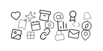
// shield-check/* Add an icon */ // Draw on the 24px grid, with round caps and joins. // Use Regular weight unless it needs Strong. // Add it to src/data/icons.ts and to one Icons group./* Decorative library */ // src/scripts/waterfall/waterfall-icon-data.ts // Lucide (ISC). Decoration only, never a control.
Buttons
Primary · arrow
Primary · small · play
Secondary
Secondary · small
Secondary · arrow


Toggle
Chip
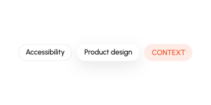
/* Usage · src/components/Chip.astro */
---
import Chip from '../components/Chip.astro';
---

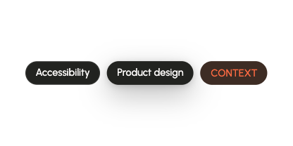
<Chip label="Accessibility" index={0} />
<Chip label="Product design" variant="raised" />
<Chip label="Context" variant="accent" />Shared
Decision card
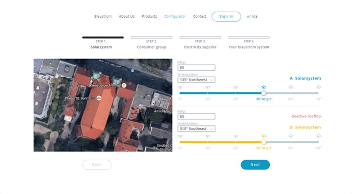
Figure
Card
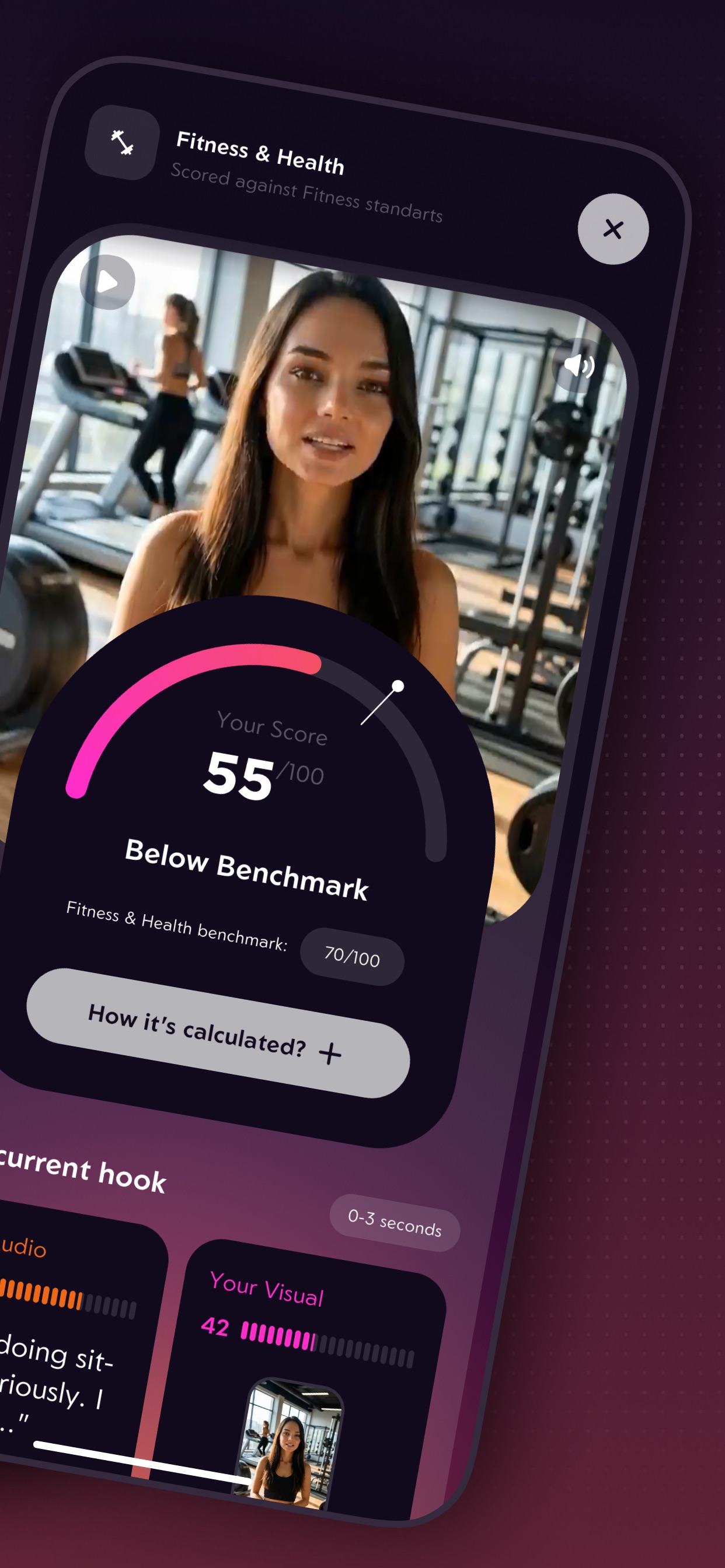
With media
Decision card
/* Usage · src/components/CaseStudyDecisionCard.astro */
---
import CaseStudyDecisionCard
from '../components/CaseStudyDecisionCard.astro';
import CaseStudyMedia from '../components/CaseStudyMedia.astro';
import ResponsiveImage from '../components/ResponsiveImage.astro';
import { blaustromConfiguratorSteps }
from '../data/blaustrom-case-study';
---
<!-- Blaustrom · figure -->
{blaustromConfiguratorSteps.map(step =>
<CaseStudyDecisionCard
title={step.title}
label={step.label}
layout="figure"
>
<CaseStudyMedia slot="media" {...step.media} />
<p>{step.description}</p>
</CaseStudyDecisionCard>
)}
<!-- Voximplant · card with Impact -->
<CaseStudyDecisionCard
title="A canvas, not a form builder"
>
<ul>
<li>Real call flows branch: verification, IVR menus, hand-offs, voicemail
detection, retries.</li>
<li>A canvas keeps large scenarios readable. A step-by-step form hides the
logic.</li></ul>
<div slot="impact">
<p>A non-technical team launches a contact center in <strong>≤ 30
minutes</strong> (Voximplant).</p>
<p>Five enterprise clients: <strong>Rappi, KFC, Burger King, Hyundai,
Jaguar</strong> run production call flows built on the canvas</p></div>
</CaseStudyDecisionCard>
<!-- Hooko · with media -->
<CaseStudyDecisionCard
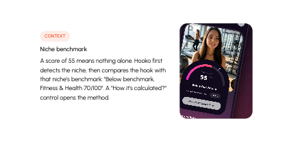
title="Niche benchmark"
label="Context"
labelVariant="accent"
layout="media"
>
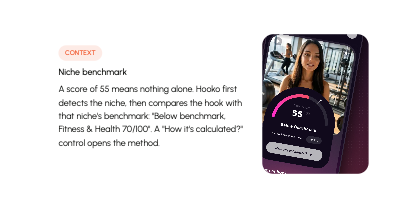
<p>A score of 55 means nothing alone. Hooko first detects the
niche, then compares the hook with that niche's benchmark: "Below
benchmark, Fitness & Health 70/100". A "How it's calculated?"
control opens the method.</p>
<div slot="media"><ResponsiveImage
src="/projects/hooko-case-study/as-2.jpg"
alt=""
width="1242"
height="2688"
style="object-position:50% 38%"
/></div></CaseStudyDecisionCard>Shared
Project card

Full card

Compact card
Identity and tags
Project card states
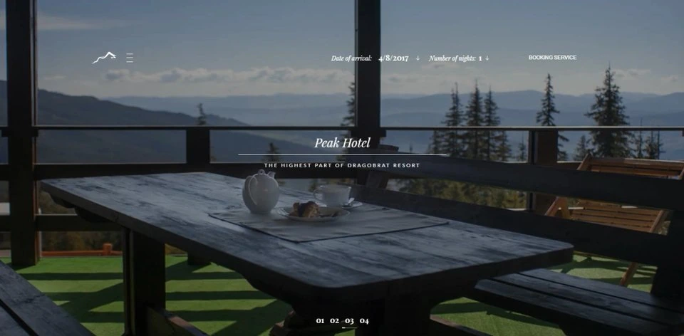
Project card
/* Usage · src/components/ProjectCard.astro */
---
import ProjectCard from '../components/ProjectCard.astro';
import {projects} from '../data/portfolio';
const [project] = projects;
---

<ProjectCard project={project} />
<ProjectCard project={project} compact />Project identity
/* Usage · src/components/ProjectIdentity.astro */
---
import ProjectIdentity from '../components/ProjectIdentity.astro';
import {projects} from '../data/portfolio';
const [project] = projects;
---

<ProjectIdentity
  title={project.title}
  logo={project.logo}
  logoBackground={project.logoBackground}
/>Project tags
/* Usage · src/components/ProjectTags.astro */
---
import ProjectTags from '../components/ProjectTags.astro';
import {projects} from '../data/portfolio';
const [project] = projects;
---

<ProjectTags tags={project.tags} />Shared
Section heading
/* Usage · src/components/SectionHeading.astro */
---
import SectionHeading from '../components/SectionHeading.astro';
---

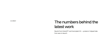
<SectionHeading id="impact-title" label="02 / Impact">
  The numbers behind the latest work
  <p slot="description" class="section-description text-body-l">
    Results from DataGPT and Voximplant Kit — products I helped take from
    zero to launch.
  </p>
</SectionHeading>

<SectionHeading
  id="hk-problem-h"
  label="Problem"
  layout="stacked"
  reveal={false}
>
  Virality scores don't tell creators what to change
</SectionHeading>Shared
Statistic
/* Usage · src/components/Stat.astro */
---
import Stat from '../components/Stat.astro';
---

<!-- Impact -->
<dl>
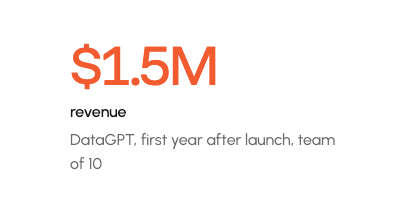
  <Stat
    value="$1.5M"
    label="revenue"
    note="DataGPT, first year after launch, team of 10"
    revealValue
  />
</dl>

<!-- Voximplant case study -->
<dl>
  <Stat
    value="2"
    label="test formats"
    note="corridor tests and moderated sessions"
  />
</dl>

<!-- DataGPT case study -->
<dl>
  <Stat
    value="30+"
    label="stakeholder interviews"
  />
</dl>Number
/* Usage · src/components/MetricValue.astro */
---
import MetricValue from '../components/MetricValue.astro';
---

<!-- Voximplant case study -->
<MetricValue value="10+" as="strong" />Shared
Timeline row
/* Usage · src/components/TimelineRow.astro */
---
import TimelineRow from '../components/TimelineRow.astro';
import { experience } from '../data/portfolio';
---
<!-- ExperienceList -->
<ol>
  {experience.map(item => <TimelineRow item={item} />)}
</ol>Timeline
/* Usage · src/components/ExperienceList.astro */
---
import ExperienceList from '../components/ExperienceList.astro';
import { experience } from '../data/portfolio';
---
<!-- About -->
<ExperienceList items={experience} />Shared
Tool card
/* Usage · src/components/ToolCard.astro */
---
import ToolCard from '../components/ToolCard.astro';
import { tools } from '../data/portfolio';
import { hookoTools } from '../data/hooko-case-study';
---
<!-- About · logo -->
<ul>
  {tools.map(tool => <li><ToolCard tool={tool} /></li>)}
</ul>

<!-- Hooko · detail -->
{hookoTools.map(({
  label, description, iconColor, ...tool
}) =>
  <ToolCard
    tool={tool}
    variant="detail"
    label={label}
    description={description}
    iconColor={iconColor}
  />
)}Tooltip
/* Usage · src/components/Tooltip.astro */
---
import Tooltip from '../components/Tooltip.astro';
---
<!-- Inside ToolCard -->
<Tooltip
  id="tool-claude-code-tooltip"
  label="Claude Code"
/>Shared